Rebranding Cre8ive Coffee to East Coast Roast
In my last post I gave an update on how things were going 12 weeks into buying a coffee business, Cre8ive Coffee. In this post I’ll run through my plans and progress on rebranding the company.
Related: 12 Weeks into Buying Cre8ive Coffee, an Update
Backstory
When I finished up at Black Hops, I fumbled around for a long time trying to work out what I was going to do. I toyed with the idea of creating a coffee brand and I liked the name East Coast Roast.
I like the name East Coast because it says Gold Coast without saying Gold Coast. It also conveniently rhymes with “roast”, making it perfect for a coffee brand. Me and my partner Erin started talking about it and then started thinking about making a cafe using East Coast Roast coffee and doing sandwiches and naming it East Coast Toast. We both thought that was cute, and we’ll probably do that at some point.
The downside with the name East Coast is it’s a pretty generic term and a location-based name, which means it can’t be trademarked. As a result, there are lots of ‘East Coast’ brands around the Gold Coast, so it’s going to be challenging to get mindshare for that word. Also there are lots of other East Coasts around the world, but I figure I have no ambition to sell overseas so that should be ok.
I had fond memories of moving to the Gold Coast, going for a surf and sitting up at Burleigh headland having a coffee afterwards. I thought it made sense to have a brand that brought that feeling to life, and it didn’t really currently exist.
But I knew nothing about coffee so starting something from scratch wasn’t really an option. So when the opportunity came up to buy a coffee company I was immediately interested. I did enough research to work out which company it was being sold, and then I snuck in to check them out. It was appealing to me that the company was quite successful, but also came with a name and a brand that I thought was pretty dated. Because I felt like if it was doing well with the current brand, it had the potential to do better with an elevated brand. Plus I love creating brands, which you’ll probably pick up after reading this 2,400 word blog post about branding.
Rebranding can be a double edge sword though. Everyone can get excited about creating a new brand, but changing an existing brand is tougher. Many people know Cre8ive Coffee. It’s been around for over a decade and our logo is out the front of many cafe’s around the Gold Coast. The current brand and the company has a great reputation, so I figured changing it might cause some issues.
Nonetheless, the plan was always to change the brand, so 12 weeks in, we’re going through that process. Here’s how I’m doing it.
Design
First off, this is the current brand. Here’s the main logo.
And here is what the packaging looks like, although the wholesale beans look different to this.
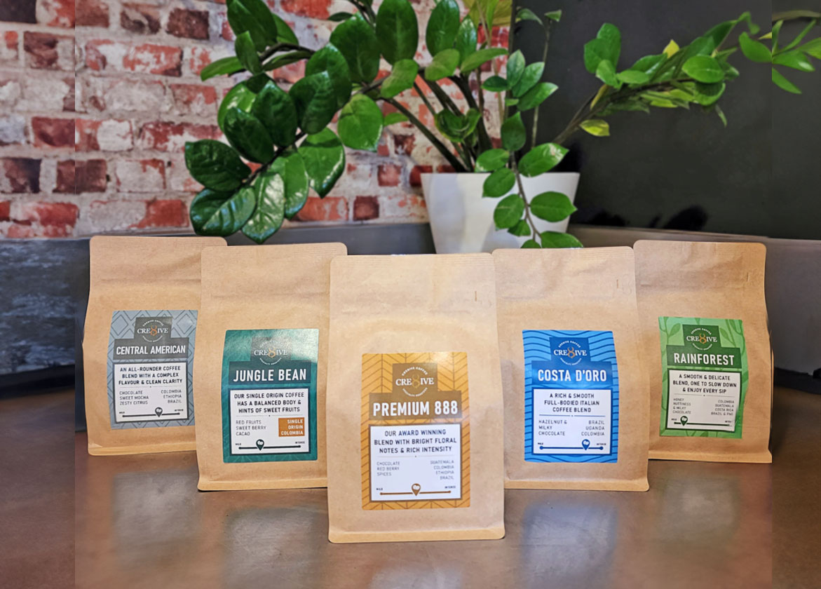
I don’t mind parts of the brand, but I think the 8 is dated and I don’t think the word ‘Cre8ive’ says anything about who we are. I think it’s super cool that we roast all of our coffee locally and we’ve been a really important part of the Gold Coast coffee scene dating all the way back to when Lindsay first started Queensland’s first coffee cart at the University 20+ years ago. That should be celebrated, and the brand should reflect who we are!
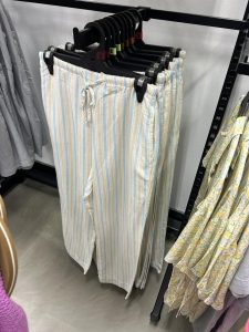
First step was to message my mate Dave Heavyside who I’ve worked with on many different projects. I sent him through a design spec for the brand. It basically said everything I’ve written above and I said I wanted it to be pastel colours, coastal and retro. I sent him a photo of some pants I saw in a clothes shop when I was clothes shopping with Erin (she thought it was weird I was taking photos of pants in a shop). They looked and felt like what I wanted for the brand. I specifically wanted stripes and colours that represented the Gold Coast.
On top of that, I wanted one main brand (East Coast Roast) but I also wanted to continue another one of our brands Costa D’oro, as our more traditional / entry level brand. I really like the name of that blend (it means Gold Coast in Italian), and a lot of our customers want something darker and more traditional. Plus it’s our cheaper blend, so I didn’t want to cross the high end brand over too much with the entry level one. So the plan was one main brand, with a few blends, then ‘Costa D’oro’ by East Coast Roast as the more traditional one.
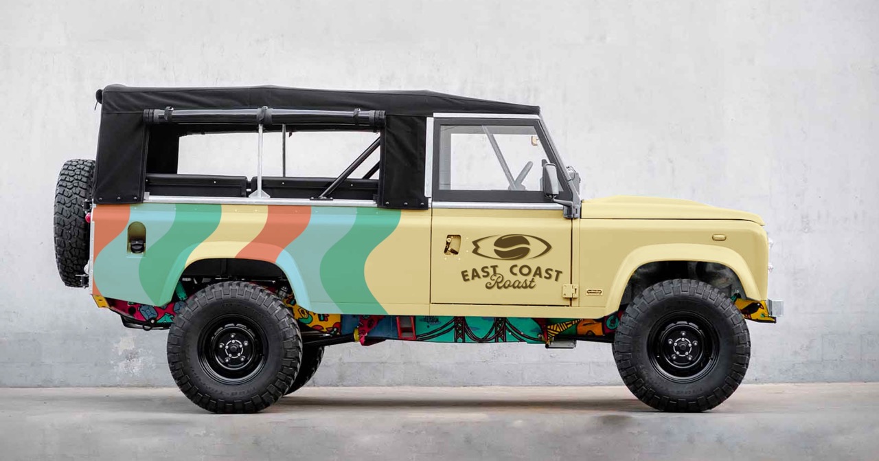
I also bought a 1977 Short Wheel Base Land Rover, which will become the East Coast Rover – a sick beachy looking coffee truck that we can use to represent the brand. I’ve always wanted one, I thought fuck it and I sent it.
Anyway Dave got to work, he sent me this back in what felt like about 5 minutes.
It wasn’t exactly what I wanted, but it was a pretty damn good start. He even mocked up a landrover, I’ll forgive him for choosing a long wheel base one and not a short wheel base (mine is SWB and looks way tougher).
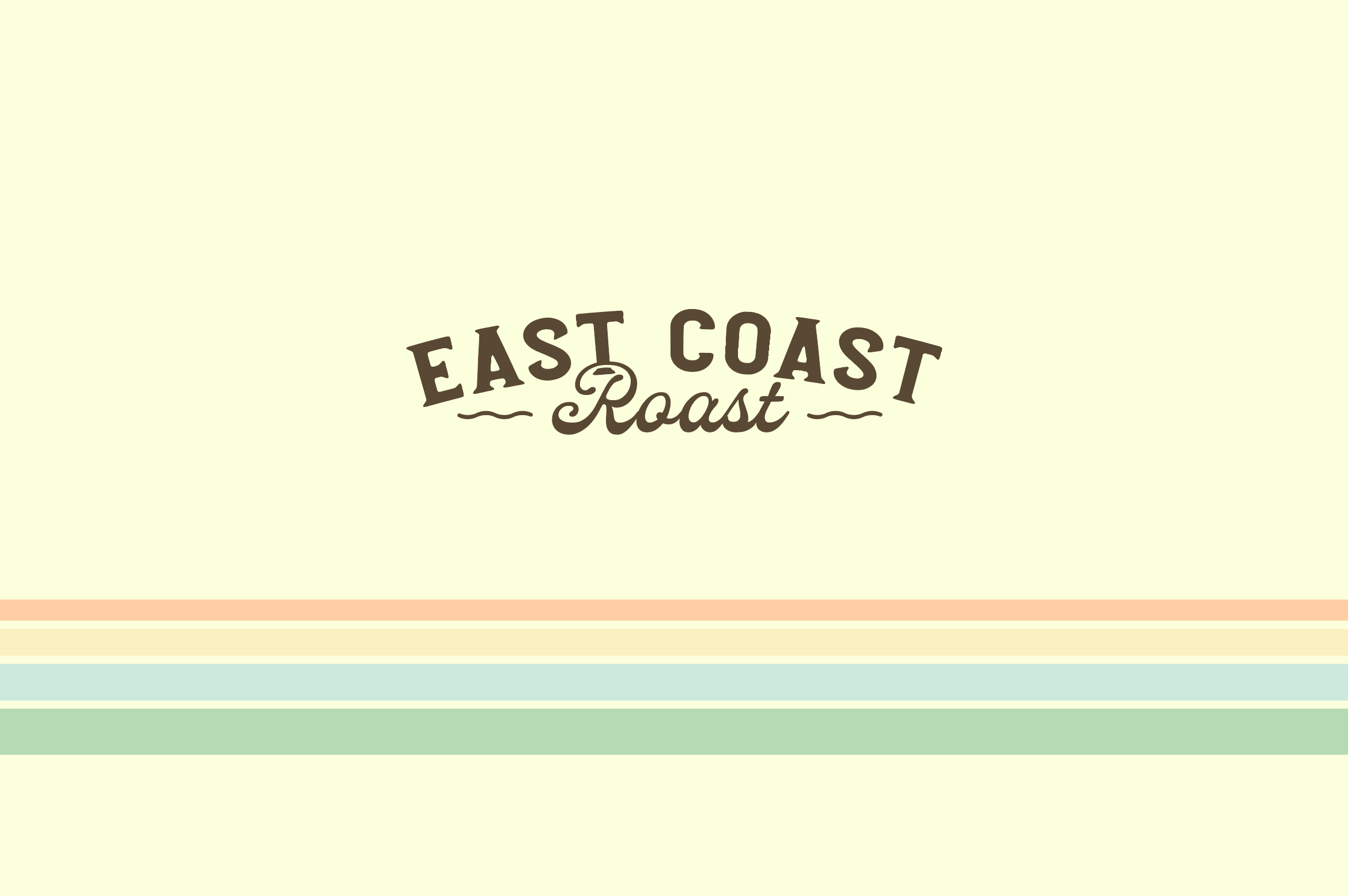
That was using a new version of the logo I didn’t like as much. There was a fair bit of back and forth, I wanted more pastel and straight lines, but generally I was happy with the way it was going. This was the next one to come through, getting closer.
He took inspiration from the surf, the sky, the beach, the hinterland and the red earth in northern NSW to come up with the colours, which I thought was super cool.
Then I sent him the following message:
“I really just need 2 things and then to get the source files and I think we can do the rest here.
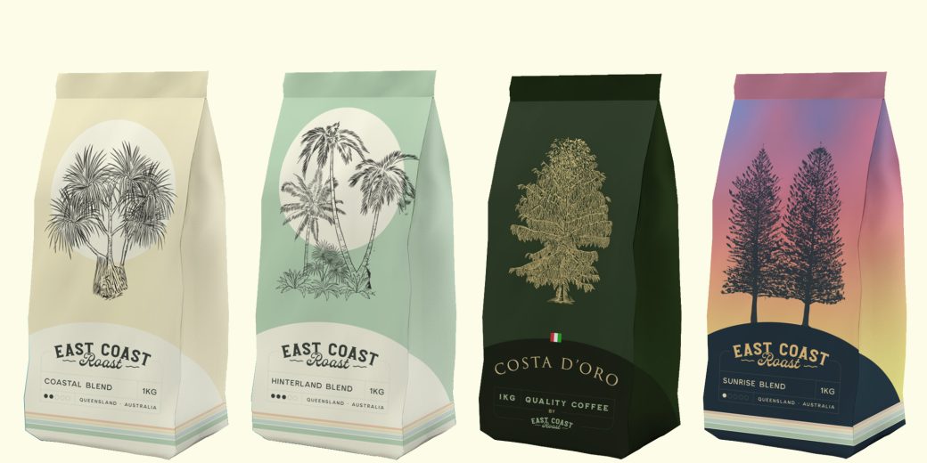
- Finalise the main brand. I like what you’ve done but I’m keen for 3 more changes. First off I want the background pin stripes to be thinner. Secondly I want each product to have a blend name so the main one could be ‘Coastal Blend’ but there wold (sic) be others. Finally I was thinking it would be cool to have some kind of background based around a tree. It could be like a watermark or just something subtle giving the whole thing a little bit more texture and the tree could loosely symbolise the blend so the main blend would be say ‘Coastal blend’ and maybe we use a pandanus for that and use other trees for their blends.
- I’m keen to have different blends so the design would be the same except for the main colour would become the colour for that blend and the tree would be different. Examples could be coastal blend as the main one (sandy colour), hinterland blend would be green, red earth blend would be red etc.”
He loved the idea but he is more of a designer than an illustrator but he knew I had another designer mate who is a really strong illustrator, so he suggested getting him to do the tree illustrations. I messaged my other designer Daniel who’s a weapon, and he sent me back 4 illustrations of some trees to include in the blends. Then Dave combined those in and sent through the first images of the actual products.
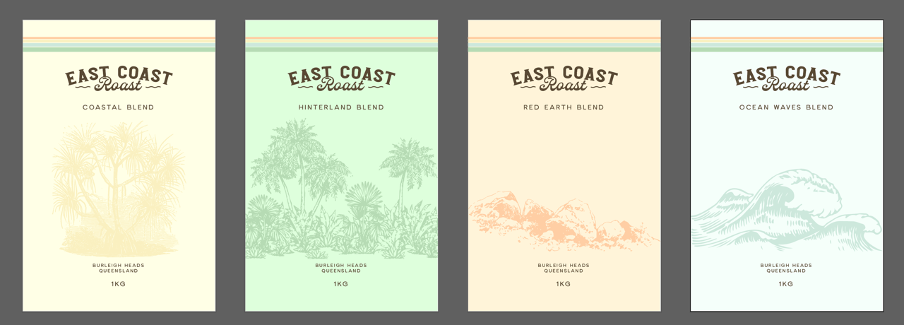
There was a bit of tweaking back and forth and we got to this concept.
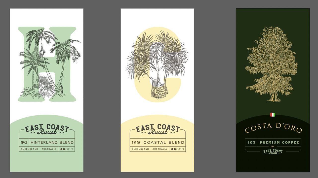
I loved the Costa D’oro one, and I liked the look of the others, especially the bottom part, but I didn’t like the letters behind the trees. We both liked that there was more contrast though, so he replaced them with a circle which sort of felt like the sun, which I thought was cool.
I also briefed him on a final blend based around the sunrise at Burleigh Heads. I wanted this one to be a limited filter release that we bring out down the track so it didn’t need to follow the normal brand consistency too much, and had to look extra cool. He nailed it.
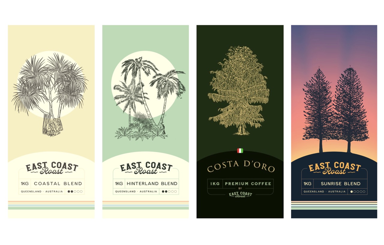
I was stoked with this, so we were ready to go. I got the source files from him, and from there I can do most of what needs to be done to apply it to other things in the business.
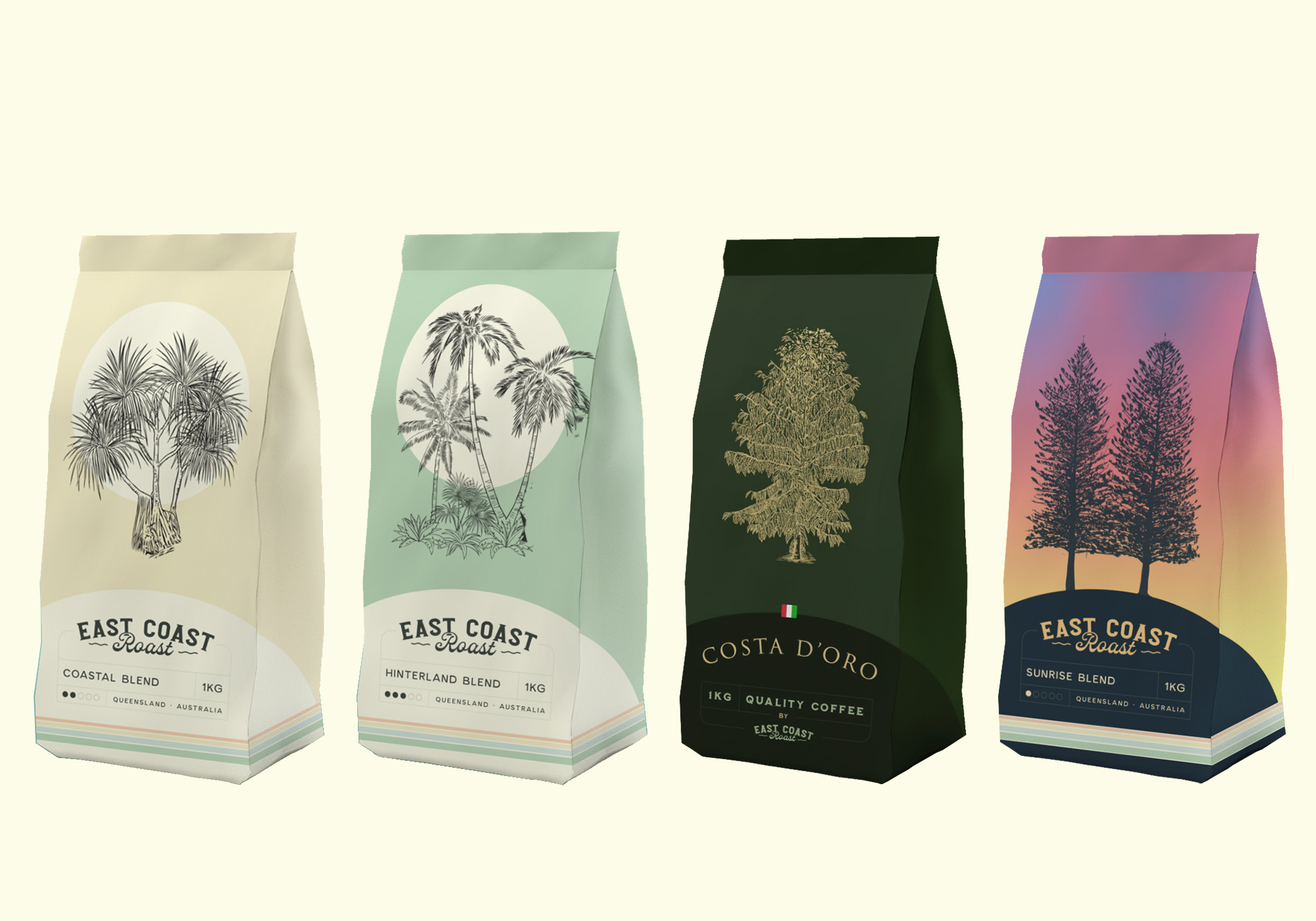
The first thing I did was created mockups of the bags using Placeit ($8 per image, not bad), in preparation for the first step in communicating the re-brand (more on that below).
Communication
I did all of the above before telling anyone about the rebrand. This happened over a few months. I wanted to present the brand in full instead of just saying we are changing the name. I created a brochure that explained in as fewer words as possible why we were changing the name, and what we were changing it to, and deal with any potential objections.
I did all of that in Illustrator and printed it on Vista print. I had 100 brochures at my desk within a week for under $100.
First stop was telling the team. I was a little nervous about it actually. The existing brand had been around for a long time and a lot of people don’t love change. I was particularly nervous about the original founder of the business who created the Cre8ive brand and I didn’t think he’d take too well to be tearing it up.
I was wrong about all of that. Everyone loved the rebrand, especially the original founder and were excited to make it happen.
I was also a little nervous about how our customers would take it because after all, it’s also the branding at their cafe – it’s not like beer where it’s one of many products in the fridge or on tap. It’s plastered all over our customer’s cafe’s, so I anticipated some push back to changing brands. So far though, the feedback has been awesome – people are loving it.
We’ve put a few brochures at the cafe at HQ and my sales guy is visiting customers with the brochure to talk through the changes.
Once we let our main customers know I have a few other things to tick off in regards to communication:
- I put up a small post on the Cre8ive website about the re-brand (see it here).
- This post you are reading is also part of the process of launching and getting a following for the new brand (if you want to follow along, follow @cre8ive_coffee Instagram, when I change the brand, I’ll continue to use this account).
- I will also send an email to our email list to let them know about the rebranding. Prior to me taking over the business, the email list was mainly used for letting customers know about price increases. I started doing a monthly update mainly so when they hear about the rebrand, it won’t be an email completely out of the blue from me. Our list is quite small so I don’t think the email will have a huge impact, but you’ve got to start somewhere.
- I’m also planning on adding ‘coming soon’ notes to invoices, quotes, email signatures, proposals, the website and Instagram bio so when it changes, people aren’t too surprised.
Implementation
In terms of rolling out the new brand, I’ve got a Google Doc with a list of tasks in it that I’m checking off one by one. Here’s the list.
- Finalise blends (we have a bunch of blends currently and we need to change the names to fit into the new brand, going to finalise that tomorrow with the new roaster and the sales rep).
Build customer list- Discuss with Roaster and Sales Rep
- Finalise blend list
- Re-do packaging – this is with Dave, should get back this week.
Create template- Finalise designs
- Send to print
- Coffee info cards – I took the designs and made them into info cards. Will finalise this week.
Create template- Finalise designs
- Send to print
- Bag stickers – this is for coffee that gets bought online or in store. I’ve done these, just need to finalise them and print them.
Create template- Finalise designs
- Send to print
- Business cards – I did these myself, have to finalise and send to print
Create template- Finalise designs
- Send to print
- Update catalogue – the catalogue is done in Canva, it’s already quite nicely designed so it doesn’t need to be completely re-done but it’s going to be a decent job to re-do it. Yet to decide if I’ll do it myself or get some help with that one, probably do it myself.
- Re-do the website – I put up a landing page at http://eastcoastroast.com.au/ using chat GPT to generate the code for me. I will ultimately migrate the current WordPress / WooCommerce site to the new domain and tweak the design a bit. But again, I don’t think it will need much, it’s not a bad looking site.
- Invoice templates in MYOB – Jess will probably do this, should be pretty quick.
- Quote template in our CRM Tall Emu (I can do this one, I made the current templates).
- Set up all new email accounts G Suite etc – the business uses Microsoft and I’m a bigger fan of Google so I’m setting up Google Workspace for the new domain.
Set up G Suite(now called Workspace)Create user accountsSet up staff with accessMove all files acrossGoogle Drive DanGoogle Drive Cre8iveMicrosoft
- Add in forwarders from old Microsoft accounts.
- Core activations – this will be a big one, hopefully we can re-skin the current ones as opposed to buying all new ones, we have a lot, $25,000+ in onsite activations.
- Umbrellas
- Flags
- Barriers
Other tasks for later
- Photoshoot – once the Landrover is done, I’m keen to do a photoshoot with the new brand, but that can come later.
- Re-design of cafe – I’m going to completely redesign the cafe at HQ. I’ve done up a rough design and we’ll work on that over the next few months.
- Wraps for the cars – We have 2 vans I’m going to give them a decent wrap so they stand out on the road.
- Subscription on the website – We don’t currently sell much online and don’t offer a subscription so I’ll launch this when we do the new brand.
- Coffee machines with our logo – this might be a bit trickier but we have a few machines with our logo built into the machine.
- Other activations – I’m working with Thirsty Merchants on a whole bunch of merch.
- Dog bowls – fun idea from our sales guy
- A Frames for cafes
- Coffee cup display – going to get some wooden ones made up
- More merch
- More shirts
- Flanno – very keen for a brown ‘Roasters Flanno’
- Keep cups
- Hats
- Socks
- PR – not sure if I’ll do much with this but perhaps I’ll organise for a story to be done.
- Re-launch day – once the cafe is all done we’ll do something fun for the locals like free coffee on the day and set up the truck out the front.
Follow along
That’s the theory, but how it goes in practice will be fun to see. If you are keen to follow along, join my weekly email list is here. And if you want to follow the brand just follow us on Instagram.
Weekly email on AI, Vibe Coding and Entrepreneurship
Join thousands of smart entrepreneurs following what I’m building, learning, and thinking about — no spam, no affiliate links, no BS.
- Vibe Coding Costs: How much I paid to build 3 Production SaaS Apps - March 2, 2026
- AI Coworker vs AI Agent — What’s the Difference and Which Should You Use? - February 26, 2026
- Overwhelmed By AI? Sign Up for Viktor Now. - February 20, 2026